JJSBlog

When 140 characters won't do.

Bestest Skyrim Mods

- Posted in Video Games by with comments

OK, a few months ago I had another heavy session of Skyrim, but unlike most times went nuts with the mods. I threw everything and the kitchen sink at it. The idea was to make things as different as possible, and while playing I wouldn't necessarily know whether something unfamiliar was something from a mod, something from the Anniversary Edition inclusions, something I hadn't seen in vanilla before, or something I'd just forgotten. A lot of times it ended up more obvious than that, but oh well.

Within a category I'll list them in alphabetical order, because that's the way I'm browsing through the ones I tracked. For simplicity, using the categories as Nexus Mods has them.

Necessities

There are a few things that might as well be called super-mods. They allow new kinds of interactions with the game such that many many mods have one or more of them as a requirement. For simplicity I largely ignored these before, but since this time I was going mod-heavy that wasn't really an option. They're not really that scary once installed, main thing is after SKSE64 you'll need to launch through its EXE rather than the default Skyrim one.

SkyUI. Changes up the menus, displays a lot more information.

Skyrim Script Extender (SKSE64). It uhh... does stuff that the end user can't really see, but other mods LOVE it.

Address Library for SKSE Plugins. Mods love SKSE and some of those also... love this?

MCM Helper. MCM for Mod Configuration Menus, so basically you'll need this if you want to properly access the settings for a lot of other mods.

Player Homes

Pass. I thought it would be kind of amusing to have a bunch of homes all over the map, but... homes aren't that fun for me. I just need a place to safely store my junk and have access to some thing like alchemy and enchanting, and the existing options cover that. So having like... absurd mansions outside of Riverwood just made for a weirder looking environment with little gain.

User Interface

A Quality World Map. Nice. A map detailed enough it made road travel more worthwhile. Rather than just knowing "Gotta go northeast", it's easy to check the map and know "OK, I can take this road north, then take a right where it splits."

Lor-Based Loading Screens. Like the title says. Just adds more variety to what is shown during the loading screen, along with information or quotes from the world of Elder Scrolls.

TrueHUD - HUD Additions. I only used this one a bit later, but it's pretty interesting. More bars floating on screen for things like enemies' health, plus change how you like your own bars displayed.

Unread Books Glow SSE. Like the title says. Useful to see which things on the shelf you haven't checked out before.

Vendor Sale Delay SSE. Tired of having to listen to stuff like "Some may call this junk. ME, I call them treasures..." every time before you can actually start your business at a business? This mod lets you get down to business.

Gameplay

Alternate Start - Live Another Life - SSE. This is great if you've already started the game a few times before. Rather than going through the standard beginning Helgen sequence before letting free into the world, you can start as... something else. All the starts are simple things. Don't expect cutscenes, just a different start location and items, a suggestion of who you are. There are even mods for this mod, that just add more possible starts. This go around I started as a beggar in Riften. So I just started with some ratty clothes and a place to sleep and that's about it.

Cutting Room Floor - SSE. Another part of my wish to fill the game with things I hadn't seen before. This tries to add back to the game some things that were partially completed and found in game files, but ultimately left out of the game. So a weird case of being content from the original game makers, but content they ultimately decided against for whatever reason.

Run For Your Lives. A little one I've been using even on previous playthroughs. Basically, if something like a dragon or vampire attacks a town... the folks who aren't soldiers run for safety.

New Locations

In general this is something that was a bit of a disappointment. I was kind of hoping I'd end up spending most of my time in new locations, but... most of them just weren't that interesting. Some that might've been decent as just "lands", but if it's not also full of interesting NPCs and quests, so what?

Beyond Skyrim - Bruma SE. The first alphabetically and easily the best of what I checked out. "Beyond Skyrim" is a sort of alliance of modmakers working on various additional lands of Tamriel and sharing resources, but Bruma is the only one that's been released. It takes place in the Bruma region that was in the north of the playable area in Oblivion, but a few centuries later. It meshes well with the rest of Skyrim, there's a lot of voice work, and unlike a lot of mods the voice work is pretty good, too. It still stands out as different when you're hearing all new voices rather than familiar Skyrim actors in role #5, but there's little getting around that.

The Shire SE. Honestly, as a land this one is pretty boring. Way too many big empty areas, and... it's Middle Earth, so it's totally disconnected from Skyrim and the items there have some crazy properties that are way imbalanced compared to main game stuff. So why is this on my recommended list? It also adds a Halfing race to the game and that's what I played as.

Followers & Companions

Amazing Follower Tweaks SE. I didn't use the vast majority of what this offers, but I used it for handling multiple followers and changing where they went home to when not with me, and for that it did well.

Really, the problem with multiple followers and some of the ones I'm recommending next is that... they don't like to shut up. So it's common enough for them to talk over each other, or in some cases try doing their pratter when a cutscene is starting. Some of the following actually enhance each other, though, as they were made to detect other popular mod followers and have special comments or conversations.

Inigo. Very nice. A lot of the followers feel like they don't totally fit in with Skyrim (at least unless you've modded it heavily a certain way), but he does. And he has a lot to say keeping things interesting. Also I just like thief khajit.

Lucien. Another that visually fits in and has a lot to say. He's a scholar, so the idea is kind of a reverse of the standard in that he's hiring YOU to help take him around the dangerous places full of fascinating artifacts.

Sofia. Sticks out more than the previous two, but she's pretty funny.

Vilja. Another one that graphically sticks out, but oh well. Maybe the most complicated followers, LOTS of interactions and options, and a very large quest that happens in drips throughout a normal play. This is actually sort of a sequel to a similar Oblivion mod, with this Skyrim character being a descendant. Terry Pratchett did some work on this mod, and more on its predecessor, and reading about that weird fact is really what got me searching through these mods some months back.

Environmental

Convenient Bridges BETA - Special Edition. I have frequently built bridges in games that allow such things, so this felt aimed right at me. It just... adds some simple bridges across rivers and other bodies of water where it can be convenient. Another similar mod: Northern Marsh Bridges.

Models & Textures

There are some that just take standard game textures and clean/upscale them using modern techniques for better results. Creation Club Anniversary Cleaned and Upscaled. Skyrim Special Edition Upscaled Textures.

Some provide new models/textures for items used throughout the world. Forgotten Retex Project. Glorious Doors of Skyrim SE. HD Photorealistic Ivy. High Poly Project. Skyrim 3D Trees and Plants. Static Mesh Improvement Mod.

Visuals & Graphics

Enhanced Lights and FX. Tweaks things a bit to make lights more realistic and moody. If it's a light in game, it acts as a proper light source for making shadows etc. I think this mod was also to blame for some weird effects like torches giving lens flare, but it seemed mostly good.

Lanterns of Skyrim II. This is one of those mods the first time I saw I wondered what would make someone care much about this. But... it really is a cool addition that changes the world a lot. Having new and proper lightsources around the world is pretty helpful for night activities.

Immersion

Extended Encounters. Just adds more to the set of random little events you can run across in the world to keep things interesting.

Relationship Dialogue Overhaul - RDO SE. Another I barely scratched the surface of what it offers. But it lets you target an NPC and change settings. Are they friendly? Can they be recruited as a companion? Etc. The name comes more from the fact that they've made sure all these NPCs have appropriate follower things to say, largely thanks to so many NPCs sharing voices with each other.

Bug Fixes

First Person Camera Height Fix. I played with a nonstandard race with a shorter-than-standard height this time, but by default when in first person I was still looking around from average man height. This helped make me feel properly short.

Unofficial Skyrim Special Edition Patch. Oldie and a goodie, patching lots of little mistakes Bethesda left behind. Unofficial SKyrim Creation Club Content Patches further fixes the newer content from Creation Club that's also included with Anniversary Edition.

Quest and Adventures

Helgen Reborn. It ended up being a bit shorter than I thought it would be--it's no DLC-sized adventure for sure--but still a good addition. Basically, rather than Helgen staying a bandit-infested burnt mess, it later becomes possible to assist in its rebuilding.

Immersive World Encounters, Final SE. This is a lot like the Extended Encounters mod earlier, with the difference being... it is in a different category. But more random events is good.

Magic - Spells & Enchantments

Pull Mastery Hookshot or Grappling Hook. This can be overpowered, but if you've Skyrimmed to death already, who cares? Gives you access to some spells that can either pull you toward something you target, or vice-versa. Not exactly as smooth as Just Cause, but it'll help you go from roof to roof.

This is Ragdoll - Fus Ro Dah for Trolls. Mostly this one is silly fun. Lets you knock people around like with Fus Ro Dah, but without it counting as an attack.

Audio

Sounds of Skyrim Complete SE. Adds new background noises mostly appropriate for wherever you are. Can be weird when you hear cats in town and there basically aren't pet cats in Skyrim, but on the whole the game starts to feel empty without it.

Utilities

BethINI. This program will work with a lot of Elder Scrolls and Fallout games. Basically allows you to play with most of the options you normally have to go into the INI files to get to, for settings not found in the standard launcher.

Skyrim SE Display Tweaks. Mostly a simple way to not have the game physics locked to 60fps, plus some other stuff.

NPC

Travellers of Skyrim - Travelers SSE. Adds more generic people traveling the roads. Usually you can interact with them to buy things or hire them, if you don't already have enough followers.

Items and Objects

Wearable Lanterns. Basically, adds the possibility to hang a little light source off of yourself and companions, lessening the need for torches in dark areas.

Miscellaneous

Rich Skyrim Merchants. This is a bit of a cheat, but oh well. Gives all merchants more money, so it's easier to make money selling stuff without having to run to ten different merchants to find some who have enough coin to give you. Has download options for 2x, 5x, or 10x.

ELSEWHERE

Open Cities Skyrim. This one is no longer on Nexus due to I think one of the dramas about people being unhappy with how Nexus does things. But anyway, I love having my big cities being part of the big open world, rather than having big doors forcing loading screens in and out. It can be an extra hassle if you really don't care, though. Some mods will have secondary mods that act as fixes for how they must interact with the Open Cities version of the worldspace rather than the original.

Breaking Bad, safe exits

- Posted in Uncategorized by with comments

While my rewatch of the series is fresh in mind, I thought it'd be interesting to consider many of the times Walt had a possible path to a happier ending, but his poor decisions and dumbassery had lasting effects that came back to bite him in the ass. Though I do recognize that I am looking at this as if they were actual events. As long as they're in a TV show, absolutely whatever path was taken would've seen new obstacles pop up.

Near the start of the show, Walt could've accepted the help/job offer from Gretchen and Elliott. A legitimate source of income, and an alternate use for that big chemistry jones.

But if not that

He could've not jumped the gun on lacking evidence and started planning on killing Tuco. This could keep him from becoming an enemy of the Salamancas in general, which was... all kinds of trouble.

But if not that

He could've stopped pushing Jesse to expand his territory. If Combo doesn't die, the chain of events leading to things falling apart with Fring doesn't happen.

But if not that

He could've tried to prevent Jane from dying. What would happen afterward is a wildcard, but either Jesse and Jane going off to spend lots of money or just Jesse and Jane sticking around Albuquerque preventing Jesse from meeting Andrea, would result in fewer problems for Walt down the road.

But if not that

He could've been less a dick to Jesse at times like when Jesse was trying to go back into business on his own. Jesse is a pretty loyal dude to those that give him half a reason, so Jesse wouldn't come up with his "If I get caught, I'll trade my freedom for Heisenberg" plan. Walt could stay retired from meth without a large amount of risk.

But if not that

If all the stuff still goes down with the rival dealers and the death of Gale, it's still possible he and Fring could come to a working arrangement. Fring seemed to make peace with Jesse, and though it was probably part of his effort to get Jesse to switch allegiances, as long as Jesse and Walt stuck together Fring still wouldn't want to get rid of them anytime soon.

But if not that

He could at least not disparage Gale's work in front of Hank, causing Hank to continue investigating Gale and eventually Fring.

But if not that

He could leave well enough alone after the death of Fring. Mike's guys are in jail staying shut up. Walt is left without much money, but compared to the start of the series his family has gained a car wash, which isn't nothing.

But if not that

Don't leave Gale's gifted copy of Leaves of Grass in your bathroom, dumbass!

How old to consider Odo?

- Posted in Star Trek by with comments

Watching DS9 lately, something I've occasionally thought about is how old to consider Odo. It's easy to just thinking of him like René Auberjonois and consider him as being mid-to-late 50s throughout the series. But that doesn't really make in-universe sense. He's a Changeling, and doesn't age like regular humanoids. He's probably looked the same way nearly as long as he's been taking a humanoid form. Really, Changeling age is a much trickier thing since they aren't born the same way as regular life forms, either. You could look at when he split off as his own entity, but for my purposes here I don't think the time he spent floating around in space or as an unexplained specimen counts.

So when did Odo start to communicate with others? What's his early timeline? Well, that's not quite clear. Memory Alpha says there was a line cut from the first episode that may have referred to his discovery being in 2337 (about 32 years before that episode), but of course... the line didn't happen. What we know for certain is he was studied at the Bajoran Institute of Science for seven years before leaving on his own. One episode with a flashback to 2365 has Gul Dukat talking about seeing Odo presented by scientists a couple years earlier, ~2363. If that was near the end of the seven years, that might suggest experimentation on Odo began around 2356. Counted from there, Odo would be 13-20 throughout the run of DS9!

Of course, once again a direct comparison to human age isn't really appropriate. Surely Odo's early years weren't analogous to early human years, and him striking out on his own after seven years is very different than a 7-year-old kid going out on their own. So for lack of anything better, let's say Odo going off on his own after getting sick of being a test subject puts him in a similar place to a humanoid getting to the age where they can legally go off their own, screw that dumb school and parents! Which varies from place to place, but let's say in 2363 Odo was in a similar place to an 18 year old human. If we age him a year for a year past that, in his time on DS9 (the show, rather than the station) he'd be 24-31. Young, but just a couple years below Kira.

I think recognizing Odo for the young being he is, both in physical experience and emotional state, makes him a more believable character on the series. His inexperience with interpersonal relationships and desire to know about his origins fit more with a young man than a 50-something.

I'm not sure how much of Discovery you saw last night, so I won't start up on that yet. However, yesterday before Discovery I messed around a bit with CBS All Access, and... I think they need to work harder.

First, their trial period sucks. I'm already in for now because I'm a big Star Trek nut, but in general they're going to be competing with services like Netflix and Prime. Whereas Netflix gives people a month to check out the services, CBS gives a week--for the version with commercials. The trial for the commercial-free option is all of two damn days.

Second, their lineup of originals kind of sucks. I know Netflix didn't come into creation with the strong lineup of original stuff they've got now, but we've known about Discovery being a pusher for All Access for nearly two years now; I thought there'd be a little more meat on the bones at this point. As far as I can see there are two proper shows (The Good Fight, Discovery) and two secondary shows (After Trek, some Big Brother thing).

Third, for something called CBS All Access, it seems to fail to give all access to CBS. Browsing the shows they show an episode count right away so it's easy to see which shows are in full and which are far from. I think Big Bang Theory had less than 10 episodes available, The Late Show seemed to have about a month's worth of shows (though The Late Late Show had many more), and Elementary only had clips.

Fourth, and considering how much they're trying to push this to Star Trek fans... I don't think it has the HD version of TNG? I wanted to put my connection to the test--what kind of quality would it default to, what kind of buffering ensued from trying too high, things like that. So I used All Good Things as my first test, and it looked surprisingly blurry even at max quality. I was at first worried even their max quality was just shit, but trying out some of the Discovery promos those came out fine. Also trying a TOS episode now, that seems to be the HD version. Trying another TNG episode now, it looks pretty bad. Like DVD version + mediocre recompression for streaming.

Being CBS, it makes sense that it has a TV focus. But having a Movies section with just 24 movies makes it seem smaller than if there was no movie section at all.

My Doctor is Steven Moffat

- Posted in Uncategorized by with comments

Steven Moffat's time as showrunner of Doctor Who is nearly up, and many seem totally jazzed about it. But his work really clicks with me. In the earlier series of the show his was the first name I began to associate with standout episodes, so when he was announced as the successor to Russell T. Davies it was like a wish being granted. His tenure hasn't been perfect, but I'd boil down the major reasons I dig his version of the show to these points.

1. I like Time Travel

With two capital Ts. I appreciate stories that really take advantage of it, moreso than just using it to set the story in an arbitrary time and place. He was pretty good at stretching what could be done in a single episode with his episodes in the Davies days like Blink and Girl in the Fireplace, but as showrunner he was both able to make this happen on many of the biggest episodes (premieres, finales) as well as having nonlinear elements that spread across a whole series or even multiple. The Doctor from the end of series 5 popping into an earlier series 5 episode. The events of the end of series 7 being a cause for events at the end of series 5. I eat this shit up.

2. I like Moffat monsters

For better and worse we're probably never going to get away from Daleks and Cybermen, but it's great to see new types of foes with new twists. Statues that can only move when not being looked at. Creatures you forget you ever saw when they leave your sight. Making fear of the dark legitimate with living shadows that can eat your flesh. Something that can hide so well... the episode can't even come to a conclusion about whether it exists.

3. I like that he goes Big

Some of this is chance. Him being around for the 50th anniversary gave him an excuse to write something Major, in this case a story that revealed an unknown Doctor and in small part brought all the past ones back. Thanks to that unknown Doctor, he put himself in the position of being the one to write around that mysterious regeneration limit. Beyond that we see him doing things like letting the Doctor get stuck on a planet for hundreds of years in a single episode (without reversing it), or get stuck in a loop that takes billions of years to work through. Destroying and recreating the friggin' universe! He's also more willing to play with the various regenerations than any showrunner I'm familiar with, like having a phone call from Eleven in Twelve's first episode. That he's pulling back the First Doctor for his last Christmas special just seems par for the course.

ALL THAT SAID, he's had six full series and then some to make his mark on the franchise and some of his hallmarks have become pretty repetitive, so it probably is time for some fresh blood. It just probably won't be blood that tickles all of my specific fancies so well.

Recently Takashi Tokita teased working on some Switch project. As he is known for among other things working on various versions of Final Fantasy IV, it caused some guesspeculation that maybe some version of FF IV could be coming to Switch. That's a bit of a specific extrapolation, but just thinking about the possibility reminded me of of some issues with portable versions of the game in the past, and in general upgrading sprite-based games for the modern age.

Original SNES FF IV was designed around a screen resolution of 256x224. The first portable ports used essentially the same graphics files, but on screens with lower resolution. End result: while walking around you see less of the world as it's been cut off.

SNES: 256x224. 100% width, 100% height, 100% overall area. Duh.
WonderSwan Color: 224x144. 88% width, 64% height, 56% overall area.
Game Boy Advance: 240x160. 94% width, 71% height, 67% overall area.

Later a 2D remake was made for the PSP. That system has a significantly higher resolution, 480x272. So it could've shown all the area from the original and then some. However, instead of rerereusing the old SNES sprites, they created new high quality ones at double the width and height of the original. The result is that when considering how much of the world is able to be viewed, you'd need to compare it to a double size version of the SNES view (512x448).

PSP (compare to 512x448): 480x272. 94% width, 61% height, 57% overall area.

So in the end the PSP version actually showed less of of the world than the GBA version, though slightly more than the WSC version.

This image tries to sum up things with black being the original SNES view, green being GBA, red being WSC, and blue being PSP. Near-white in the midle is the area they all share.

So what would be the realistic options for something on Switch's 1280x720 screen, assuming integer multiples?

x1 (compare to 256x224): 500% width, 321% height, 1607% overall area.
x2 (compare to 512x448): 250% width, 161% height, 402% overal area.
x3 (compare to 768x672): 167% width, 107% height, 179% overall area.
x4 (compare to 1024x896): 125% width, 80% height, 100% overall area. (To be more precise 100.45%)

Either x3 or x4 would be pretty valid options viewed this way. x3 would essentially maintain the height and add more width, which is traditionally what people think of when things "go widescreen". However x4 would still show the same amount of world as the original, just trading off some height for width--and even the lost height isn't as much as any of the previous portable versions.

This image sums it up. This is just a comparison between how much of the world (compared to SNES original in green) is shown; in the real world the blue (x3) and red (x4) options are the same physical size.

Of coooooourse the other way out of all this sort of mess is to go full on polygonal like the remakes of FF III and IV on DS (later ported to mobile devices and PC). Then scale really has no meaning, and can be changed on the fly.

So I originally wrote the following shortly after the Switch reveal. I guess I never quite finished it, as it's sat in a tab in my text editor since then. I've made some slight changes to that version, updating with some things that seem less hazy now than they did then, though the real real reveal tomorrow night may change things yet again.


Though Nintendo is being coy about it replacing the 3DS, if all goes well Switch is intended to be the next step for Nintendo both at home and portably. That being the case, I thought it would be interesting to see how it looks as a successor individually to 3DS and Wii U. By the time they really decide to push the 3DS to the backburner they might have something like a more portable model of Switch available, but for now I'm working with the unit to be released in March 2017. And unfortunately since a lot of it is still uncertain, there is some rumor and guesswork in here.

From 3DS

PRO Resolution. Comparing from one eye's view of the main screen, 400x240 to 1280x720 is 9.6x as many pixels. Considering all the screen portions 400x240x2 + 320x240 to 1280x720 is 3.4x as many pixels.

Screen size. The original 3DS top screen is about 5.6 square inches. The 3DS XL top screen is about 10.5 square inches. The Switch scren dwarfs both at about 16.5 square inches. HOWEVER, the 3DS XL's top screen plus bottom screen added together do beat it, with a combined 19 square inches.

Tech specs. A lot is unknown about Switch's actual processors, but from what is known it seems ridiculously more powerful. Switch will have about 32x as much RAM as 3DS, and it seems like the rest of the improvements will be even bigger. Though it does somewhat depend on whether Switch is in docked or undocked mode, which apparently changes the GPU speed significantly.

Controls. Largely like those of the New 3DS, with the extra shoulder buttons and second analog control. However, both analogs will be full sticks, and sounds like one set of shoulders are analog as well. The controller portions that split off should allow for dual motion controls and possibly pointer as an alternate to touch. Touch will now be multi-touch, as opposed to the single touch of 3DS and DS.

Multiplayer. Local wireless and Internet play still possible, but now local multiplayer through shared or split screen is pretty standard too. Easy to get many two-player games going thanks to using the joy-cons individually.

CON Battery life. Rumors have varied on this quite a bit, but sounds like it might be worse than original model 3DS's was.

Size. Screen size is nice, but most people will find it impossible to fit Switch in a standard pocket.

Dual screen / clamshell. If you've come to appreciate the dual screen / clamshell design over the last dozen years as I have, unfortunately it's gone too.

Camera/mic. It seems there is no camera or microphone standard on Switch? There is some doubt on this.

From Wii U

PRO Resolution. Wii U Gamepad was 480p screen, Switch is a 720p screen. So 1.5x the pixels in either axis, or 2.25x overall. TV output for games probably maxes out at 1080p in either case, though Switch being more powerful it should hit it much more often. In fact with the GPU speed difference between docked and undocked, it seems designed to make 720p on the go and 1080p on TV an obvious choice.

Tech specs. Again there's a lot we don't know about Switch, but depending on how things pan out and whether it's in undocked or docked mode, it can probably do 2-5x as much as Wii U. RAM seems to only be doubled from Wii U, but rumor says the non-OS portion of RAM will be about triple what was available to developers on Wii U. Overall, still a fair gap below Xbone or PS4.

Architecture. Less exciting than pure spec numbers, but much of the Wii U was built with Wii compatibility in mind, and thus in some ways hampered back to GameCube tech designed at the turn of the century. With modern tech in, even though of the kind designed for mobile devices, Switch is a much easier target for current multiplatform games and middleware than Wii U was.

Controls. Largely the same as what's found on the GamePad, except one set of shoulders should be analog. Dual motion and possibly pointer should allow for somewhat more advanced version of wiimote / nunchuk controls. Single touch on the screen now multitouch.

Off TV Play. If you imagine undocked Switch as an evolved form of Off TV Play, then this is one where 100% of games work with it and the range is infinite, versus a couple dozen feet for the GamePad. Also since it's not an image being transmitted wirelessly there's no image quality loss from compression.

Multiplayer. Local shared/split-screen play and Internet play still possible, but now local wireless connecting to nearby Switches should be a pretty normal thing, too.

Sleep mode. Being a staple of portables it's necessary here, which will add some convenience for quick long-term pausing.

CON Dual screen. When docked the image outputs to TV and the tablet screen is mostly physically blocked, so games built around different things happening on the TV screen versus a held screen do not seem possible.

Camera/mic. It seems there is no camera or microphone standard on Switch? There is some doubt on this.

NX is Switch

- Posted in Video Games by with comments

So today the NX was unveiled as the Nintendo Switch, and... it's pretty much exactly what the solid rumors of the last few months have said, so my previous post about why I was positive on NX still applies. There are a few things technically still up in the air. Like after the video, people started wondering why it never showed the screen used with touch? And relatedly, the split controllers were never explicitly shown to use motion controls, either. So was it an indication Switch has a regressive control scheme in order to make identical controls for home/go modes easy? I don't think so. The same solid set of rumors that were right about 90+% of everything so far also say it's got a multi-touch screen and motion controls similar to Wii Remote Plus, so why start doubting them now? It seems like Nintendo just wanted to push a simpler message today about playing the same games at home or on the go with a few standard control options, and didn't want to deviate into more specifics in a 3-4 minute video.

As is always the case, there is some doubt about whether the name is good. I'm a bit split on it. I don't think it's particularly awful, and don't think Switch is worse than Box, Cube, Station, or other things game systems have been named... except they haven't been ONLY named those things. Without some other word attached, Switch feels kind of like some regular dictionary word accidentally got promoted. Just Switch, not GameSwitch or XSwitch, or PlaySwitch or any other such thing. I could go for the DipSwitch myself, controlled by the Dip-Cons and the analog Dipstick.

One of the more interesting rumored/speculated things that turned out to be accurate is that the two controller halves (Joy-Cons) can each be used individually for simpler multiplayer control. A big question was how do you design something that works well both in tandem vertically and solo horizontally? The answer seems to be... well, you have to let one suck a bit more. The sideways mode definitely doesn't seem the way many would choose to play. The analog stick and buttons are cramped pretty close together, and depending on whether you're using Joy-Con L or R they're off-center to one side or the other. What are the shoulder/trigger buttons when played normally are still present, but will be located awkwardly to either the left or right side. Still, I see this as more of the emergency setup. If you're really planning on some multiplayer you'll get extra sets of Joy-Cons or Pro Controllers, but this is the way that you can be sure to NEVER be without a multiplayer option, and any two Switch owners who meet up are equipped to get four-player going.

There's been some concern about Nintendo saying it's first and foremost a home console. Buuuut this seems totally a PR thing, like back in 2004 when they were claiming the DS was a third pillar separate from GBA. In this case, the Wii U is much deader than the 3DS, so it needs replaced first. There's also that while neither price nor battery life has been announced yet it seems both will be notably worse than 3DS for now, so it's better to talk up its console side while 3DS is more slowly phased out over the next couple years. By that point Switch can be cheaper and have better battery life, either by way of larger battery or system revisions. Maybe even a smaller variant meant more for portable play, the opposite of the XL machines the DS and 3DS got. But it still seems clear Switch is the basket Nintendo intends to put all of its development eggs into if the public will let them.

One game I was very happy to see in the video was Skyrim! With the remaster coming it was one I hoped for as there was no technical reason not to, but feared that either due to western third parties' dismissive nature towards Nintendo machines and the hardware not being out for months after the remaster's October release it would be considered too late. But here it is. Some question why it's such a big deal for a port of an old game shown in a new console announcement video. I'd say the biggest thing is it shows Nintendo getting support from companies who traditionally haven't bothered with their hardware, and showing off a type of game that's never had a proper portable version is no little deal either.

There were snippets of some other Nintendo games in the trailers, but not a whole lot to tell about them from a few seconds of footage each. The 3D Mario platformer did interest me, though--with the camera angle used it didn't seem like a "3D World" style game, and nor did it seem to be based on planetoids like the Galaxy games. So it seemed most similar to the oldest 3D Marios, Super Mario 64 and even moreso Super Mario Sunshine--and by the time this one releases it might be 15 years since SMS's release.

GameMaker Arrays

- Posted in Uncategorized by with comments

So I wanted to continue working on the system of different asteroids for different sizes. My thought is I'll have an array (or series of parallel arrays) which will have information like minimum mass, maximum mass, sprite used, name of object. Then given a certain mass it can pick only from valid options. Both a minimum and maximum are because I figure it's more interesting if there's some overlap between types of objects, rather than a flat cutoff. Or it could even be possible to have rare objects that only exist in a very narrow range. Whatever. But before doing this I needed to see how arrays work in GameMaker, and it seems... kind of stupid. More a pain to use than in other languages I've dealt with.

Thing 1: Initializing arrays. In some languages, you can just give a specific size for an array. In other languages, it doesn't set limits, and you can even use words as keys for the array rather than just a series of integers. In GML, you need to initialize every spot in the array similar to declaring a variable, before the program is allowed to do anything with it. Like for Zenzenzen purposes if I wanted to keep track of the last 10 asteroids I merged with for whatever reason, I'd first have to do some sort of loop and set lastmerged[i]=0 as a default value or whatever.

Thing 2: Initializing the data in arrays. In PHP which I've used the most in recent years, if I want to set up an array with multiple values it can be as simple as $Names = array("Josh", "Zach", "Austin", "Luke"). In GML that isn't done. I'd need to have a line for name[0] = "Josh"; and another for every other value. It seems like unless you're dealing with a very small set of data it will be the sensible thing to set up a file with the data (or a string which can be made to be treated like a file) and read that into an array with a loop.

Asteroid types

- Posted in GameMaker by with comments

Asteroid types

One of the plans from the beginning was that as the player grew, they'd see different types of objects, while thus far I've just used the one asteroid shape. Well today I've added two more. Still crude placeholders and the code working them is also basically a crude placeholder, but now that the crude way is up and running I can replace bits of it at a time.

I added in new sprites for circle and diamond asteroids, each with the same number of color variations as the original. When an asteroid is created it checks its mass. If it's over 10000, it's a diamond. Otherwise if it's over 100, it's a circle. Otherwise, it's the regular asteroid. Regardless of sprite, behavior remains the same. Also added in that pressing X creates a random asteroid at a random location on the screen, with possible mass ranging from 1/10 to 100x the current ship mass.

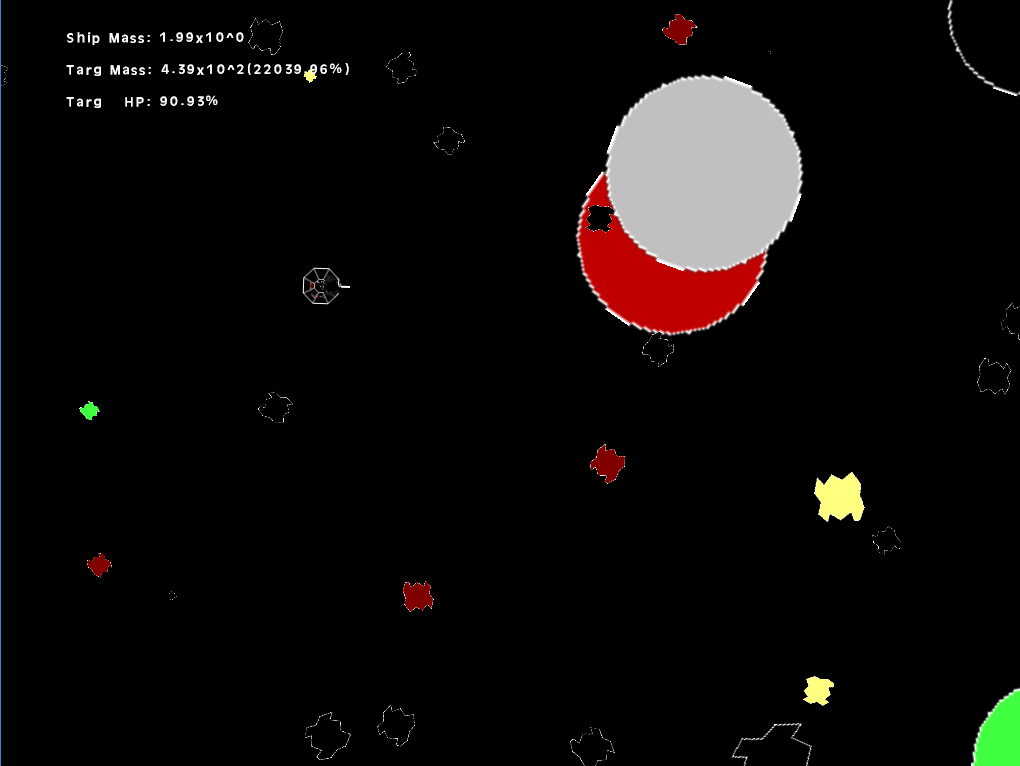
Here's a shot from early on, with a few large circles in play.

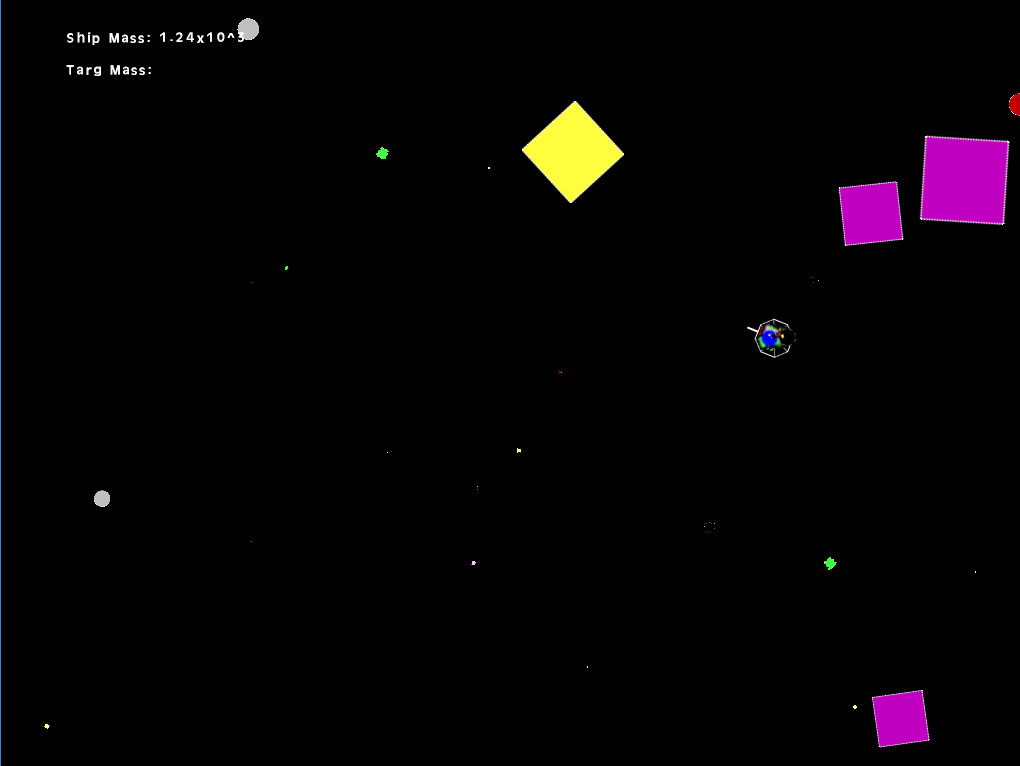
And later having built the ship up, things look like this. If you look closely at the ship, you can see now-small circle asteroids layered on it.