Recently Takashi Tokita teased working on some Switch project. As he is known for among other things working on various versions of Final Fantasy IV, it caused some guesspeculation that maybe some version of FF IV could be coming to Switch. That's a bit of a specific extrapolation, but just thinking about the possibility reminded me of of some issues with portable versions of the game in the past, and in general upgrading sprite-based games for the modern age.
Original SNES FF IV was designed around a screen resolution of 256x224. The first portable ports used essentially the same graphics files, but on screens with lower resolution. End result: while walking around you see less of the world as it's been cut off.
SNES: 256x224. 100% width, 100% height, 100% overall area. Duh.
WonderSwan Color: 224x144. 88% width, 64% height, 56% overall area.
Game Boy Advance: 240x160. 94% width, 71% height, 67% overall area.
Later a 2D remake was made for the PSP. That system has a significantly higher resolution, 480x272. So it could've shown all the area from the original and then some. However, instead of rerereusing the old SNES sprites, they created new high quality ones at double the width and height of the original. The result is that when considering how much of the world is able to be viewed, you'd need to compare it to a double size version of the SNES view (512x448).
PSP (compare to 512x448): 480x272. 94% width, 61% height, 57% overall area.
So in the end the PSP version actually showed less of of the world than the GBA version, though slightly more than the WSC version.
This image tries to sum up things with black being the original SNES view, green being GBA, red being WSC, and blue being PSP. Near-white in the midle is the area they all share.

So what would be the realistic options for something on Switch's 1280x720 screen, assuming integer multiples?
x1 (compare to 256x224): 500% width, 321% height, 1607% overall area.
x2 (compare to 512x448): 250% width, 161% height, 402% overal area.
x3 (compare to 768x672): 167% width, 107% height, 179% overall area.
x4 (compare to 1024x896): 125% width, 80% height, 100% overall area. (To be more precise 100.45%)
Either x3 or x4 would be pretty valid options viewed this way. x3 would essentially maintain the height and add more width, which is traditionally what people think of when things "go widescreen". However x4 would still show the same amount of world as the original, just trading off some height for width--and even the lost height isn't as much as any of the previous portable versions.
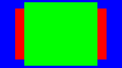
This image sums it up. This is just a comparison between how much of the world (compared to SNES original in green) is shown; in the real world the blue (x3) and red (x4) options are the same physical size.

Of coooooourse the other way out of all this sort of mess is to go full on polygonal like the remakes of FF III and IV on DS (later ported to mobile devices and PC). Then scale really has no meaning, and can be changed on the fly.

Comments